Insurance Agent Microsite
Role: UX
Brief
The client, an insurance company called Combined, asked my team and me to create a tool for Combined Insurance agents to create a personalized microsite to assist in their sales efforts.
Goals
- For the visitor: To learn about if this agent and insurance company is a good fit for their needs.
- For the agent: To have a page that helps support their sales pitch, and is easy to customize.
Team
- Me (I was involved from the user interviews to the first round of design presentations to the client)
- Two other designers
- A project manager
- An offshore development team
Process Overview

Research & Discovery
Eight thirty-minute interviews were conducted over a one week period to ensure sufficient depth, breadth and variation in points of view were considered. Interviews were focused on understanding how agents describe their role and Combined as a company, client engagement, and use cases for a dedicated agent site.
Drawing from the agents' responses, the other UX designers and I made a list of features that spoke to those findings.


Design
We sketched out multiple layouts of components, and researched different UI styles and layouts. We decided on a single column design so elements were less dependent on each other for agents with varying amounts of content. We wanted the design to:
- Highlight Strengths of both the individual agent and also the company
- Be Flexible to allow for different combinations of components without breaking the design
- Consider both audiences, both prospective / existing clients
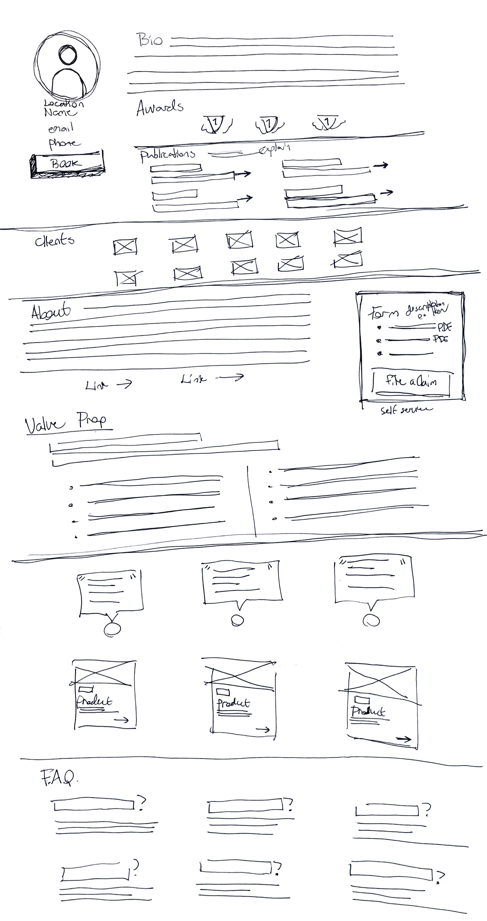


Notated Wires

This was the extent of my involvement. The other designers did the visual design.
Takeaways
This was the first time I was involved in user interviews, and the first time I made wires based on findings. I loved it!